Project management can be boiled down to organization. Having the right information lined up and available to you is what leading a project is all about. But how can you make sure you’re getting the statistics you need to make the right decisions?
There are different types of project management charts you can use to plan, schedule and control your project. They help project managers do their jobs better by facilitating task coordination and stakeholder communications. Diagrams help you manage the triple constraint of time, cost and scope, which are the forces that exert their rule over every project. Often, they’re most useful for project scheduling, which is a process that can be greatly simplified with the help of diagrams.
Let’s compare three of the more popular examples of project management diagrams: Gantt Charts vs. PERT charts vs. network diagrams. What are they used for, what are the pros and cons, when in the project cycle are they used and which is best for what purpose? First, let’s define each, then compare the pros and cons.
Gantt Chart vs. PERT Chart vs. Network Diagram
It can be easy to confuse these three project management charts. They all work to help with schedules and often do so in similar ways. But, for however much in common these three diagrams may have, there are distinct differences.
Let’s compare the Gantt chart, the workhorse of project management, to the PERT chart and network diagram, which are both network-style graphics. We’ll take a look at what they do and don’t do, so you know which is most viable to help your project.
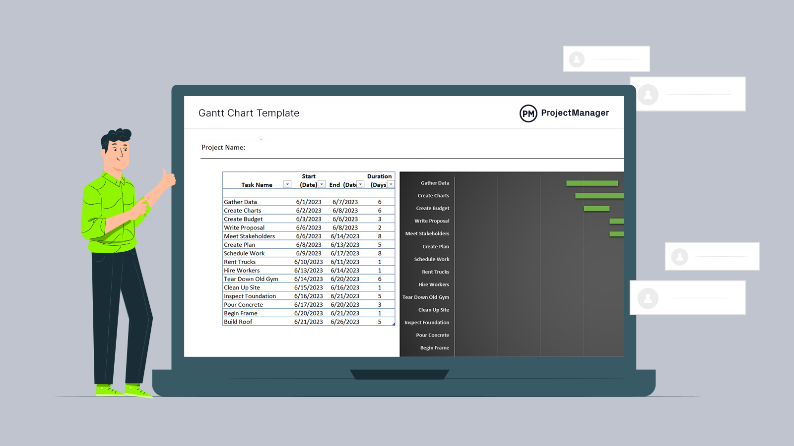
Get your free
Gantt Chart Template
Use this free Gantt Chart Template for Excel to manage your projects better.
What’s a Gantt Chart?
A Gantt chart is used to visually represent project schedules on a timeline. A typical online Gantt chart is broken up into two halves. Tasks are listed on the left side in a traditional spreadsheet fashion, but the timeline to the right offers a quick and easy way to understand the project schedule in its totality.
There are several ways to create a Gantt chart, such as using a Gantt chart template or even drawing one by hand. However, the best alternative is to use a Gantt chart maker. There’s a wide variety of choices available in the market, but they’re all not the same. Some Gantt chart software are just an app with a limited featured set, while others come with robust project management features.
ProjectManager is more than just a mere Gantt chart maker, it’s a cloud-based project management software with project planning, scheduling and tracking features. Getting started is easy – you can start from scratch, or you can use one of our built-in, industry-specific templates. Once you’re up and running, you can add tasks, set dependencies between those tasks, and calculate exactly how long your project is estimated to take. If you’re looking for a Gantt chart that can fulfill all your project needs, try ProjectManager for free today.
When Should You Use a Gantt Chart?
Gantt charts are probably the most versatile project management tool there is because they can help you throughout the project life cycle. Gantt charts can help you take the tasks from your project scope and organize them into a project timeline which you can use to track the progress of your projects.
They’re used during the project planning phase to create a project schedule but are used throughout the project execution phase as a tool to track the progress of tasks until they’re completed.
Gantt Chart Template
Creating a Gantt chart from scratch using a pen and paper, Excel or any other similar methods can be time-consuming and lead to mistakes and inaccuracies in your project schedule. For that reason, we’ve created a free Gantt chart template for Excel which is ideal for creating a visual timeline for your projects.
Or better yet, you can try ProjectManager’s Gantt chart which is a far superior choice than any Gantt chart template for Excel or Google Sheets thanks to its project planning, scheduling and tracking features.
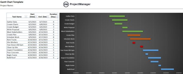
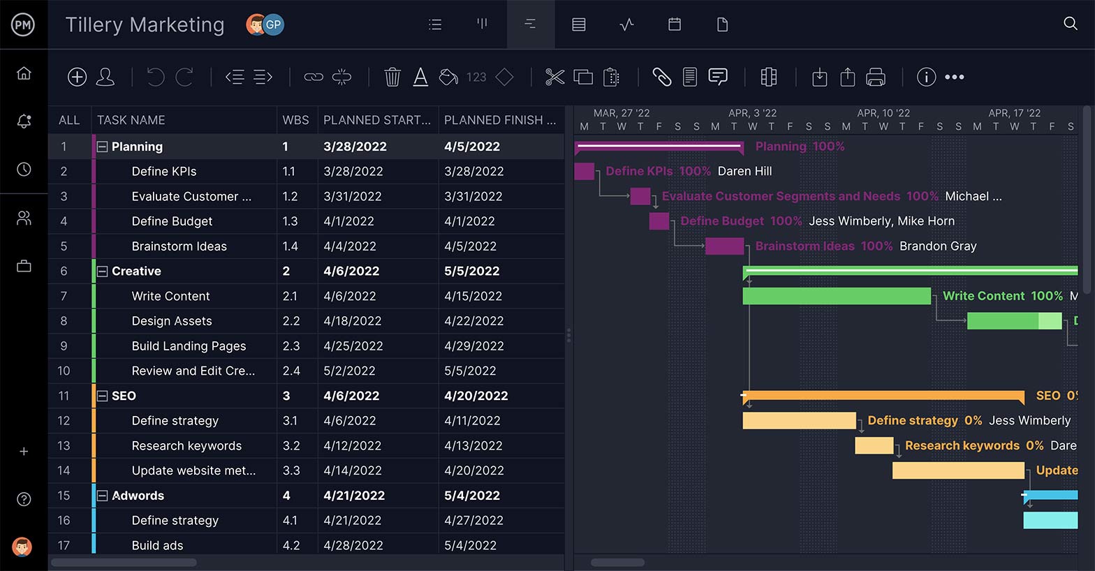
Gantt Chart Example
Here’s a quick example of a Gantt chart that was created using ProjectManager’s Gantt chart tool. On the left side, it has a spreadsheet that contains a list of project tasks, their costs, due dates, assignees and other important information. On the right side, there’s a project timeline that shows the duration of each project task, task dependencies, percent complete, project milestones and more.
The Difference Between Gantt Charts and PERT Charts
Gantt charts and PERT charts can both be used for the project scheduling process because they help map project tasks, identify task dependencies, estimate their duration and track due dates. However, PERT charts and Gantt charts are two very different tools.
The main difference between them is that while a PERT chart is a helpful project management chart it can only be used for project scheduling, while Gantt charts are a much more versatile project management tool that can help you allocate resources, map project milestones, track project costs and more.
What’s a PERT Chart?
PERT stands for Program Evaluation Review Technique and refers to the method of using a graphic to plot the tasks that must be done to complete a project. It uses arrows to show the tasks needed to reach an event, which are symbolized by nodes. A node represents a completed project phase. They’re used to help estimate the time it’ll take to complete tasks in a project.
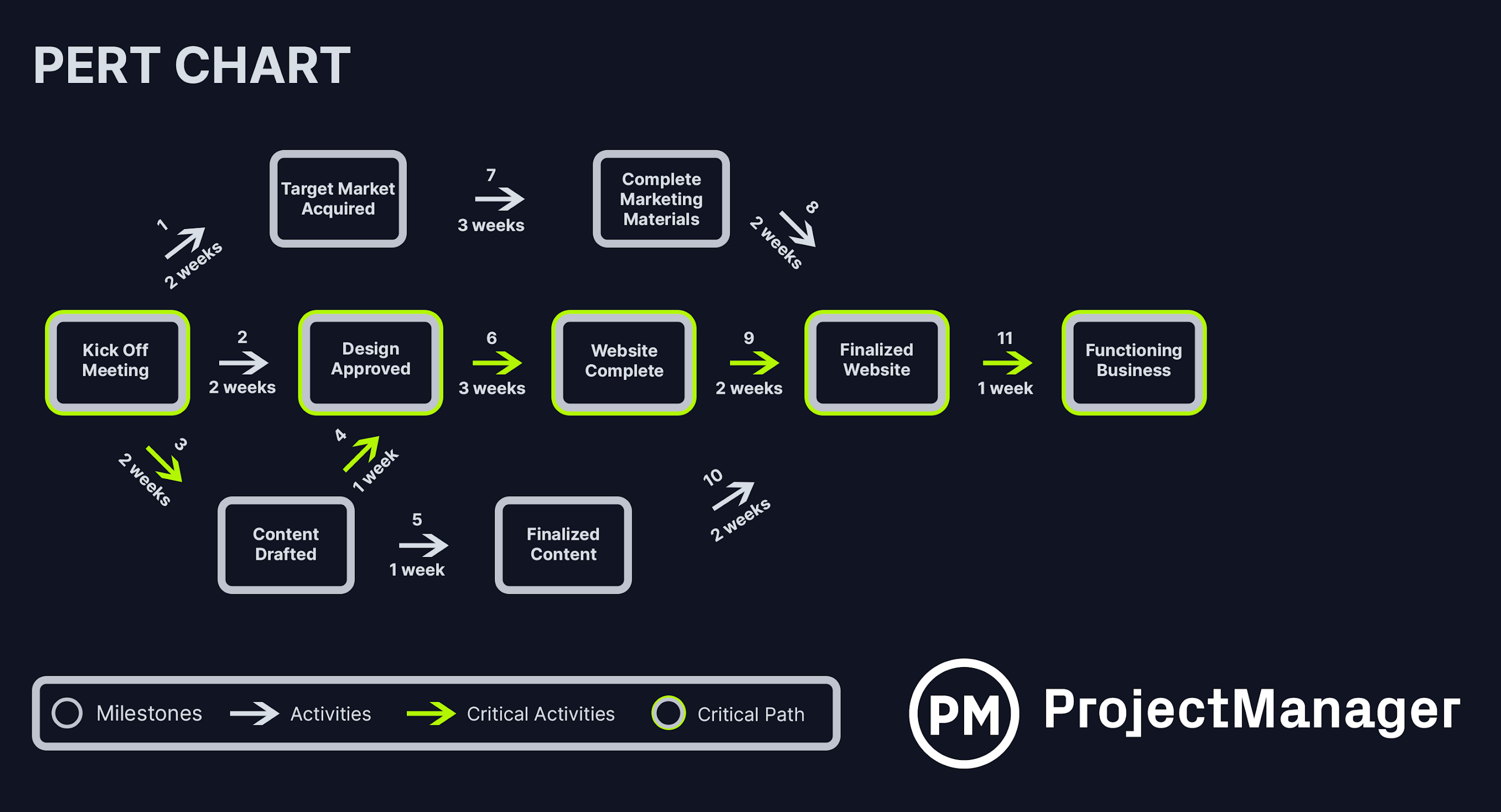
PERT Chart Example
The best way to explain what a PERT chart is and how it works is to take a look at one. The example below shows a PERT chart that was created to manage the project of creating a website for a business. Each of the boxes represents a project task, while arrows show task dependencies and the order in which task sequences must be completed from left to right.
Those arrows also indicate the estimated time that each task will take to be completed, which will allow the next to start. You can use a PERT chart to add the duration of all your project tasks and calculate the total duration of your project. Finally, the example below also shows the critical path of the project, which can be easily identified by finding the longest task sequence in the PERT chart.
When Should You Use a PERT Chart?
As you can see from the example above, PERT charts allow you to visualize the entire project timeline in one easy-to-understand diagram for your team members and project stakeholders. Besides project scheduling, PERT charts can also be used to estimate the resources that will be needed for each project task and make sure you use them on your critical path activities.
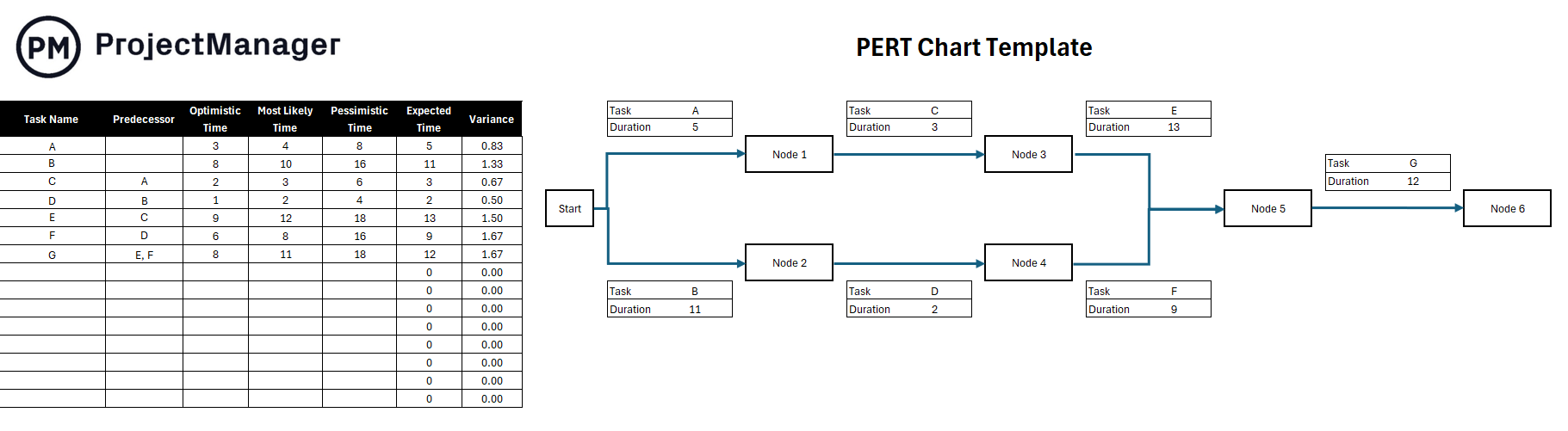
PERT Chart Template
Want to try applying a PERT analysis to your project? Download this free PERT template for Excel. The forumlas are already baked in, and the diagram is made—all you have to do is input your values to complete your PERT chart.
Gantt Chart vs. PERT Chart: Why Gantt Charts are Better for Project Management
Both Gantt charts and PERT charts are visual tools that help organize tasks when building a project schedule. The obvious difference is that a PERT is a network diagram, while a Gantt is a bar chart.
PERT charts are great in that they clearly show you task dependencies. That is if one task can’t start or end until another task has started or ended. Because it assists with calculating the critical path, you can also know what the early or late starts are for your tasks, which helps you predict how likely it is that you’ll get to end the project earlier. This means you can save time and make better decisions, managing data and what-if analysis.
Related: Free Project Scheduling Templates
On the negative side, it’s hard to scale a PERT chart. They can be a problem when working on larger projects, as it become overly complicated to quickly discern. If you want to print out the chart that, too, can be a problem because of their unruliness and size. The larger the project, the more complex the PERT chart and more difficult to read it. It’s also not a good tool to measure project progress, for which a Gantt has got it beat. Making a PERT chart is time-intensive.
Here are some reasons why you should use Gantt charts instead of PERT charts.
- Gantt charts allow you to track more details about your project tasks, while PERT charts are limited to only showing project task names, duration and due dates
- Gantt charts are an important tool that’s included in most project management software, while PERT charts are rarely offered
- Gantt chart software helps you adjust your project schedule by dragging and dropping tasks on the project schedule
- While both are visual tools, Gantt charts show the project schedule on a project calendar that offers a more detailed overview of the project timeline than the PERT chart diagram
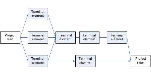
What Is a Network Diagram?
A network diagram is a schematic that shows all the tasks in a project, who is responsible for them and the flow of work that is necessary to complete them. In other words, they help visualize the project schedule. Like the PERT chart, it’s also made up of arrows and nodes that show the course of tasks through the life cycle of a project. It can be used to track progress and scope once a project has been executed.
Network Diagram Example
Network diagrams, like PERT charts, can be used to visualize the order in which task sequences and workflows should be completed. But the main difference between them is that network diagrams lack the information that’s needed for project planning or project scheduling such as task due dates or duration. They’re meant to provide a high-level overview of your project for purposes like presenting to executives or project investors.
When Should You Use a Network Diagram?
Besides being a project management tool, network diagrams are also ideal for mapping out any type of task sequence such as operational workflows and business processes. No matter what you use them for, they will help you plan the order in which tasks and steps need to be completed to allocate your resources, coordinate the efforts of your team and achieve the goals of your action plans.
Gantt Charts vs. Network Diagrams: Why Gantt Charts are Better for Project Management
Like PERT charts, a project network diagram is a flowchart that shows the sequential workflow of project tasks, whereas a Gantt is a bar chart that shows the project schedule in a graphic representation.
Gantt charts tend to focus on tasks and time management while the project is ongoing. The timeline is easy to see, as it’s clearly marked from its start date to end date. Resources can be added to the Gantt to help with allocation. Also, progress can be tracked, as well as status.
Network diagrams, on the other hand, are great for planning. They help to identify all the tasks you’ll need to complete your project. This includes finding those critical tasks and identifying float. This all works to make ordering materials and equipment easier, which assists in your financials.
However, network diagrams aren’t without their problems. Let’s take a quick look at the main reasons why Gantt charts are a better tool for project managers than network diagrams.
- Gantt charts offer many more project scheduling features than network diagrams, while also showing a similar visual representation of project timelines
- Gantt charts can be used for managing all areas of project management, while network diagrams are only used for workflow management
- Each bar in a Gantt chart represents a project task and their size varies depending on their duration which means Gantt charts allow you to visualize the duration of each task, while network diagrams don’t
- It takes a while to make a network diagram, and it’s hard to adjust it if there are changes to your project scope
- Network diagrams, like PERT charts, can become overly complicated as the project grows in size
Online Gantt Charts from ProjectManager
Gantt chart, PERT chart or network diagram…. which to choose? While each has its purpose, Gantt charts have developed and matured as they moved from static paper to dynamic online platforms. ProjectManager is an award-winning cloud-based software that has taken Gantt charts to the next level.
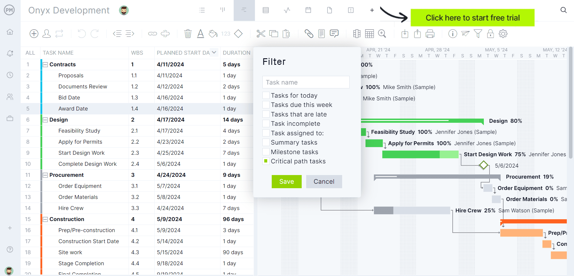
Dependencies Made Easy
For one, our Gantt charts are not merely for scheduling timelines, though they do have a bar chart that lists all the project tasks and their durations. Using online Gantt charts allows you to link to dependencies, which is one of the main draws of PERT charts and network diagrams. Just pull a task to the task that it is dependent on, and a dotted line appears between them. This lets you better manage your schedule while their executed, so teams aren’t blocked and you can avoid bottlenecks.
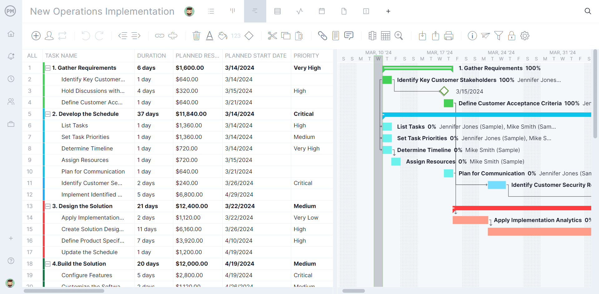
Set Baselines & Track Progress
Network diagrams help managers calculate the critical path, but that’s a time-consuming equation. You can filter your Gantt charts by the critical path, and there it is, right on your timeline! The Gantt can be filtered in many ways, such as setting the baseline, so you can see the actual progress against your planned progress and keep the project on track.
Automatic Updates & Easy Changes
A big complaint about Gantt charts is that they’re difficult to make. Then, when things change in a project plan, which they always do, you have to build another Gantt chart. Not with our tool. Editing is as simple as dragging and dropping the tasks to its new start or due date. Everything dependent on the task that changes is automatically updated and everyone associated with the task on the team is updated on that change, again automatically.

The Gantt is but one of multiple project views, including kanban boards, task lists and a calendar view. All of the views are seamlessly integrated with a larger suite of project management tools that manage resources, generate one-click reports, monitor progress at a high level with real-time dashboards and so much more. PERT charts and network diagrams have a lot of catching up to do.
ProjectManager is an award-winning tool that organizes projects and teams, helping you better plan, monitor and report on projects. Online Gantt charts control tasks, kanban boards visualize workflow and dashboards track progress. All your project management needs in one tool. End the Gantt vs. PERT debate and try our online Gantt chart and suite of PM features today with this 30-day trial.
