A Power BI dashboard is one of the many visual tools for data analytics and business intelligence offered in Microsoft Power BI. But a Power BI dashboard isn’t the easiest feature to configure. We’ll illustrate how to create a Power BI dashboard to help clear that hurdle.
There are pros and cons to using a Power BI dashboard, which we’ll explore, and show how they work with Power BI reports. There are also integrations with Power BI that can help make dashboards that are easier to use and capture more pertinent data.
What Is a Power BI Dashboard?
A Power BI dashboard, also called a canvas, is a single page that tells a story through data visualizations. A lot of information can be collected on the Power BI dashboard, which makes it imperative that it’s well-designed and only captures the highlights. Clicking on the charts and graphs will take users to related and more detailed reports.
The various visualizations seen on the Power BI dashboard are called tiles. Users pin the tiles to the dashboard from reports. Think of the dashboard as a high-level overview of the underlying reports and semantic models it reflects. Many different tiles can be pinned to a Power BI dashboard, such as a tile from a report, another dashboard, or Excel. Images, videos and more can also be added to the Power BI dashboard.
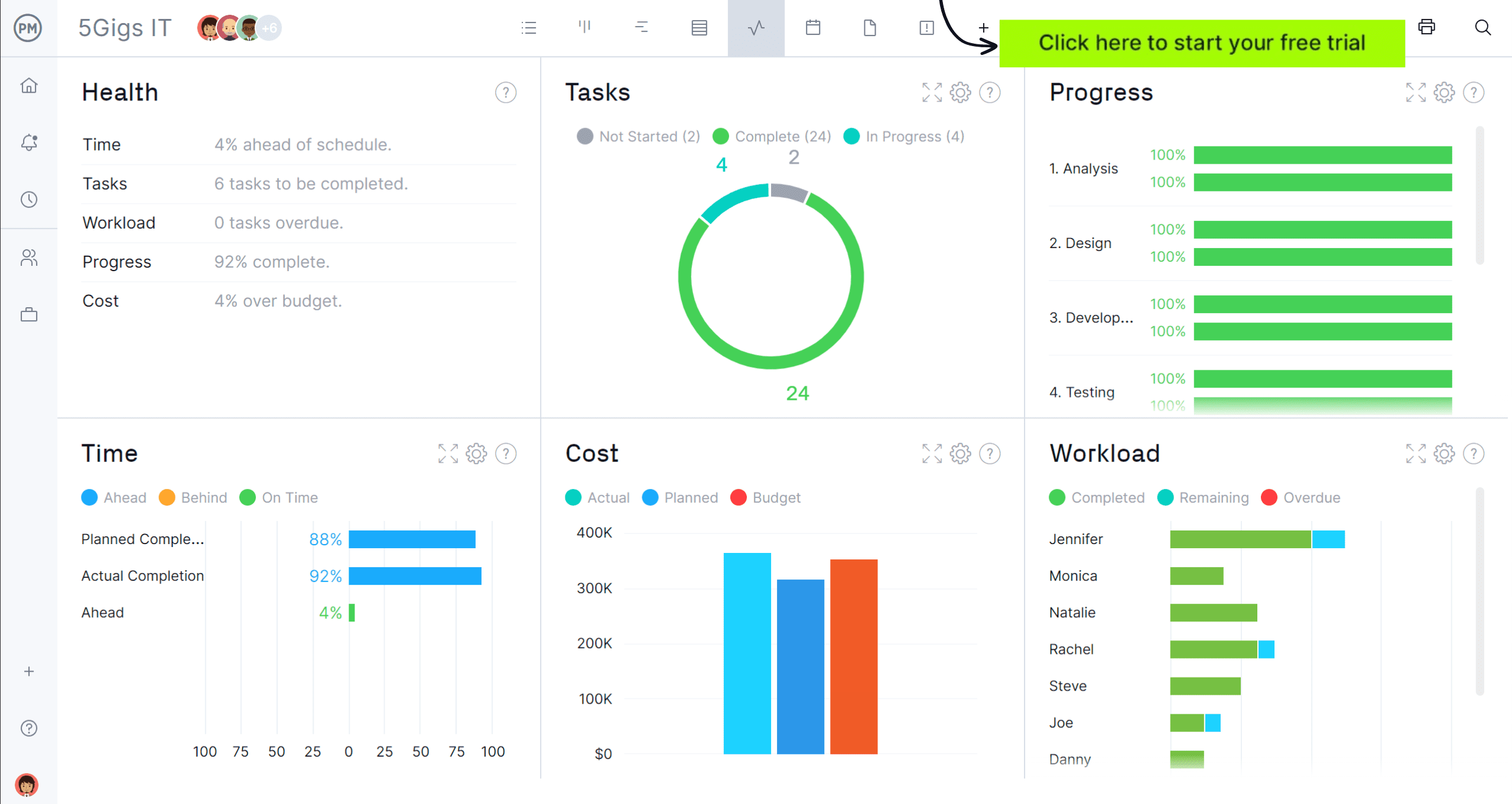
While Power BI dashboards are good for visualization, they’re hard to make and require customization. That takes time away from more important project tasks. A Power BI dashboard should be helpful, not frustrating. ProjectManager is award-winning project and portfolio management software with automated dashboards that don’t require lengthy and complicated setup and update in real time. Power BI users can even integrate with ProjectManager to deliver project data to Power BI. Get started with ProjectManager today for free.

Microsoft Power BI Dashboard Example
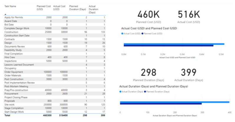
We’ve created a Power BI dashboard that can help you compare estimated costs and duration of project tasks against their actual values. This Power BI dashboard example shows tasks for a construction project. It combines a table, stacked bar charts and numeric card values to help you determine whether your project has been completed on budget and schedule.

Depending on the type of project data, you can use other Power BI data visualization tools such as pie charts, scatter charts, line charts and other types of graphs and custom visuals.
ProjectManager Is the Best Power BI Integration for Project Management
A dashboard for Power BI has a lot of value, but it can be difficult to build. The whole point of a dashboard is to have a simple visual tool to understand complex information. Having to go through a complicated and lengthy process to create one defeats the purpose. ProjectManager is award-winning project and portfolio management software that automatically creates powerful real-time dashboards that integrate with Power BI to import project information with financial data for better decision-making. Power BI isn’t a project management tool. Our software does more than monitor data.
Use Multiple Tools to Plan, Schedule and Monitor Projects
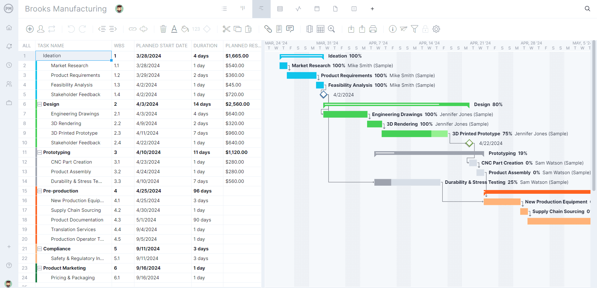
Unlike Power BI, our software has all the features to plan, schedule and monitor projects. Managers can schedule tasks on robust Gantt charts or the sheet view that link all four types of task dependencies to avoid costly delays, filter for the critical path to identify essential tasks and set a baseline to track actual progress against the planned progress to help stay on schedule.
Teams can execute tasks on powerful task lists or kanban boards to visually manage their workflow and stakeholders can get an overview of the project’s progress on the calendar view. Real-time dashboards monitor the project at a high level and customizable reports provide more detail.

Monitor the Team’s Availability, Workload and Labor Costs
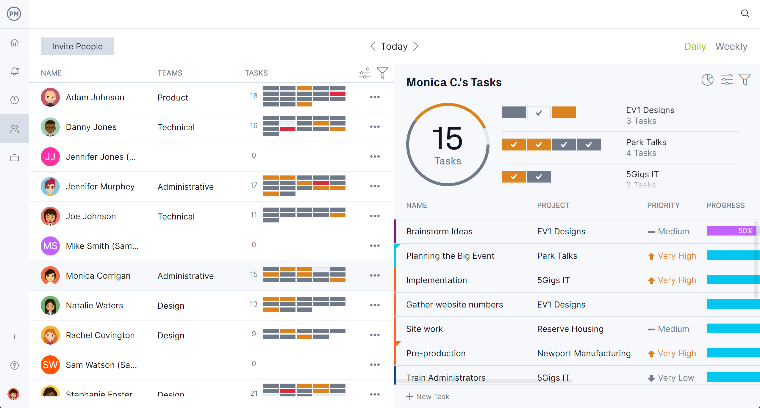
Managing resources delivers successful projects. When onboarding teams, set their availability, including PTO, vacation time and global holidays to streamline assignments. Then use the color-coded workload chart or team page to see who is over or underallocated.
Managers can balance their team’s workload from those pages to keep everyone working at capacity, which improves morale and boosts productivity. Use secure timesheets to help facilitate the payroll process but to also get visibility into how far each team member is in finishing their tasks. That way managers can see if they’re on schedule and labor costs aren’t negatively impacting the budget.
How to Create a Dashboard in Power BI
Getting the key insights from a Power BI dashboard doesn’t require certification in IT. A Power BI dashboard can be built from one or several reports. This allows users to see the report data that compiles multiple pages on one page. However, a Power BI dashboard can’t be filtered like reports or edited. Follow these steps to build a dashboard in Power BI.
1. Import Data and Choose the Information to Display in the Power BI Dashboard
Start by opening Power BI and from the navigation pane select My Workspace. Click on Get Data at the bottom of that menu. Under files, select Get and find the Excel file and click Import. Power BI will then automatically import that data.
2. Select the Graphs & Charts With Which to Build Your Power BI Dashboard
Many graphs and charts can display data on the Power BI dashboard. Below are some of the more common ones.
- Bar Charts: Standard way to look at specific values across different categories. You can use these to make a Gantt chart in Power BI.
- Pie Charts: Shows the relationship between the part to the whole.
- Area Charts: Line chart with the area between the axis and the line filled in. These emphasize the magnitude of change over time.
- Matrix: Like a table with two dimensions, but easier to display data meaningfully across multiple dimensions.
- Scatter and Bubble Charts: Has two value axes to show one set of numerical data along a horizontal intersection of an x and y numerical value, combining these values into single data points.
- Gauge Charts: A circular arc that displays a single value that measures progress towards a goal.
3. Use Slicers and Filters to Analyze Your Data
Slicers are a user-friendly approach to making simple selections to filter the Power BI dashboard. Filters are displayed along the right side of the report and enable users to apply a set of values and narrow the results displayed on the dashboard.
4. Make and Share Reports With the Team
With the report server feature of Power BI, users can make, share and publish project reports and dashboards. There are also collaborative features that allow users to share these reports and dashboards within their workspaces and everyone in that channel will be notified when a new report is generated.
5. Update the Data in the Power BI Dashboard
To ensure that the dashboard is displaying current data and not outdated, it must be updated. This is done by replacing the old report after updating the report on the desktop. The dashboard will automatically update.
Power BI Dashboard vs. Report
While a Power BI dashboard gets data from the underlying report, the two are different features. A Power BI dashboard is a collection of data that is visually displayed to tell a story in charts and graphs. A report is usually a detailed summary of the large data set as per the criteria given by a user.
Reports are generally multiple pages, dashboards display only the important information from large data sets and are used for quick decision-making. Reports are also embedded with slicers and filters. If the summary table shows only monthly sales, by adding the category field to the slicers, one can select each category individually and see how each category performs across months. Dashboards don’t have this interactivity.
Dashboards can create alerts to email when a specific condition or criteria is met or a limit is crossed. Reports, however, can’t create alerts to email when a specific condition or criteria is met or a limit is crossed. Source data isn’t viewed in the Power BI dashboard because the user only gets single-page information. Reports, on the other hand, can see tables, data sets and data fields in detail. Therefore, both Power BI dashboards and reports are important for monitoring data, they do it differently.
What Are Power BI Dashboards Used for?
A Power BI dashboard is a data visualization tool to make it easier to analyze large data sets. They can import data from an Excel spreadsheet, a CSV file or other formats and the user can choose among a variety of Power BI charts and graphs to make the dashboard and visualize the data more digestibly.
Power BI dashboards are integral to an organization’s business intelligence strategy. They should be purpose-built and designed to analyze data from key data sets. This will help businesses improve their decision-making process. Rather than analysts having to manually compile spreadsheets, using a Power BI dashboard allows them to access, analyze, display and share data on web-based dashboards. Stakeholders can review, draw conclusions and act from the data on Power BI dashboards.
Non-technical users can leverage Power BI dashboards to take complex data and make it understandable and approachable. For example, Chipotle uses Power BI dashboards to create a unified view of their restaurant locations. They can then streamline their analytical processes to identify trends, both positive and negative and even offer predictive insights. Another example is when Charles Schwab helped bank branches create Power BI dashboards to track performance. They tracked customer satisfaction with their products without having to analyze pages of spreadsheets.
Related Power BI and Dashboard Content
For readers who want to learn more about dashboards, below are a couple of blog posts that explore must-have project dashboard tools and a free project dashboard template for Excel that can be downloaded now. Also, there’s a piece on how to make a Gantt chart for Power BI.
- 4 Must-Have Project Dashboard Tools
- Project Dashboard Template (Free Excel Download)
- What Is Power BI? Uses, Features and Pricing
- Power BI Gantt Chart: A How-to Guide With Pros, Cons & Alternatives
ProjectManager is online project and portfolio management software that connects teams whether they’re in the office or out in the field. They can collaborate by sharing files, commenting on the task level and staying updated with email and in-app notifications. Join teams at Avis, Nestle and Siemens who use our software to deliver successful projects. Get started with ProjectManager today for free.


