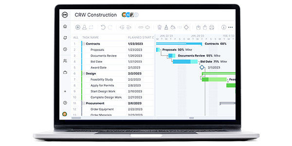
Microsoft Power BI is a great analytical tool and that alone is a benefit for anyone managing a project. However, project management is more than generating reports and monitoring dashboards. Project managers need Gantt charts to schedule work, link dependencies, add resources and costs and track progress to deliver those projects on time and within budget.
Does Power BI have a Gantt chart or can users cobble together one and will it have all the advanced features that project managers and their teams need to successfully deliver projects? We’ll answer those questions and more as we take a closer look at Power BI and Gantt charts.
What Is Power BI?
Microsoft Power BI is a data analysis software that allows you to use various tools such as spreadsheets, pie charts, stacked bars and other types of diagrams to visualize project or business data, including the Power BI Gantt chart.
Power BI allows you to import data from a variety of file formats and sources such as Microsoft Excel, SAP, Oracle, Google Analytics and other software and applications, which makes it a versatile tool that most organizations can use for data analysis.
Power BI can help you better analyze the data your business or project generates so you can make better decisions. But is Power BI good for project management? To answer that, let’s first review the Power BI Gantt chart, which is one of its key project management features.
Does Power BI Have a Gantt Chart?
The question of whether Power BI has a Gantt chart is an important one, but why? Gantt charts are an essential planning and scheduling tool across projects. It houses data across the entire project in one easily accessible location that the whole team can access.
Beyond being a visual tool, Gantt charts can link dependencies to avoid delays and set milestones to help with tracking. Gantt charts help organize tasks, resources, costs and more. Project managers use Gantt charts to break projects into phases and make them more manageable. So, is there a Gantt chart in Power BI?
Short Answer: Yes, Power BI Has a Gantt Chart
Power BI doesn’t have a built-in Gantt chart feature but you can still use it to create a Gantt chart by installing the “Gantt” custom visual by Microsoft, a free app that allows Power BI to map out data using Gantt charts. You can get this app from Power BI’s AppSource, an online store in which you can find apps, add-ons and extensions for Power BI.
Installing this custom Power BI visual is an easy process that won’t require you to leave Power BI. We’ll explain how to get this custom Power BI visual, add it to your report and use it to create a Gantt chart in more detail below.
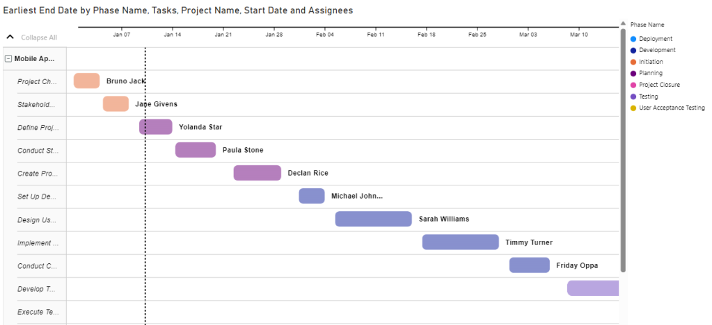
Long Answer: Power BI’s Makeshift Gantt Charts Lack Key Project Management Features
The Power BI Gantt chart extension allows you to create a basic Gantt chart that can help you visualize your project schedule and track your team’s progress. However, the Power BI Gantt chart doesn’t have any project management features, which makes it a limited tool. It’ll only allow you to create a view-only Gantt chart based on the data that’s manually entered by users but can’t be edited.
For example, the Power BI Gantt chart won’t let you adjust your project schedule by dragging and dropping tasks or adjust their duration by manually increasing their size. There aren’t advanced project planning features such as linking the four types of task dependencies, identifying the critical path, tracking project costs or syncing with other related project management tools like kanban boards, task lists, timesheets or dashboards.
On the other hand, ProjectManager‘s Gantt chart doesn’t require any manual setup and has all the project management features you need to plan, schedule and track your projects. Assign tasks to your team members, create a project schedule, track resource utilization and monitor project costs.
The best part is that ProjectManager’s Gantt chart syncs with its other project management tools like timesheets, kanban boards, workload charts and project calendars. So if you’re looking for a Gantt chart tool that can help you manage your projects and collaborate with your teams online, ProjectManager is a better alternative than a Power BI Gantt chart. Get started with ProjectManager today for free.
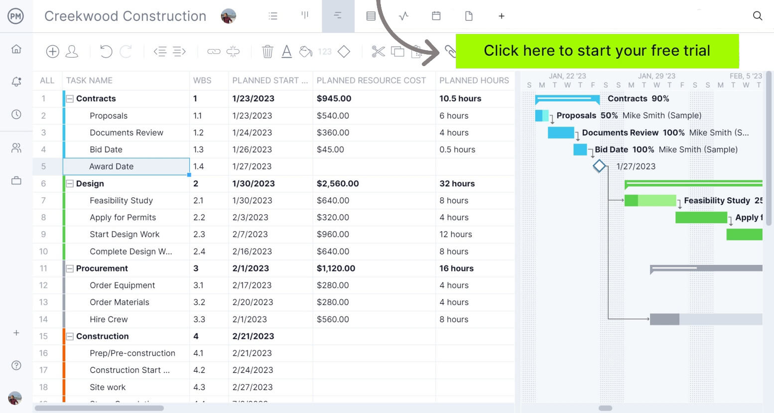
How to Make a Power BI Gantt Chart Better With ProjectManager
ProjectManager’s robust Gantt chart allows you to link the four types of task dependencies, identify the critical path of your project, monitor resource allocation and track task costs. Additionally, it allows you to assign tasks to your team members, set task priority levels and due dates and collaborate with your team by sharing messages and files. Try it free for 30 days.
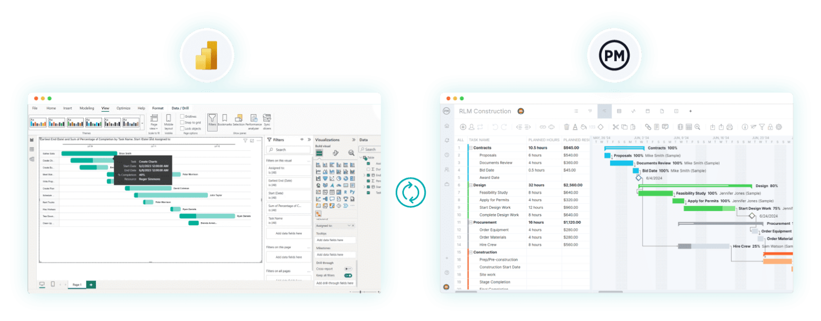
1. Export & Import Your Power BI Project
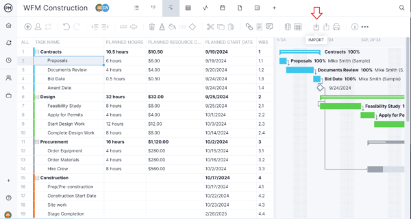
Choose the project from Power BI that you want to export and save it as an Excel or CSV file. It’s now ready to import into ProjectManager. In ProjectManager, toggle to the Gantt chart view and click on the import button. Click “Select File” and find your Power BI project.
2. Add to New or Existing Project
You’ll need to decide if you want this data to be added to a new or existing project. If you’re adding it to an existing project, be sure to note whether to keep the existing data or delete it.
3. Choose What Data to Import
Then, you’ll be able to choose if you want to import all of your data from the Power BI file or only the task list. Select the option you want to import.
4. Success! Create an In-depth Power BI Gantt Chart
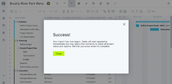
When the “Success!” window pops up, the process is finished. Your Power BI file has been imported and now you’re ready to use a real Gantt chart in ProjectManager.
Power BI Gantt Chart Key Features
The Power BI Gantt chart shows simple information about your project tasks, including their name, due dates, duration, percent of completion and project resources assigned to them. Here are all the customizable data fields that allow you to decide which data you’d like to display on your Power BI Gantt chart: task name, parent task, task duration, due dates, task percentage of completion, project resources for each task and project milestones.
Let’s take a closer look at a Power BI Gantt chart example to better understand what’s included in a Power BI Gantt chart.
Power BI Gantt Chart Example
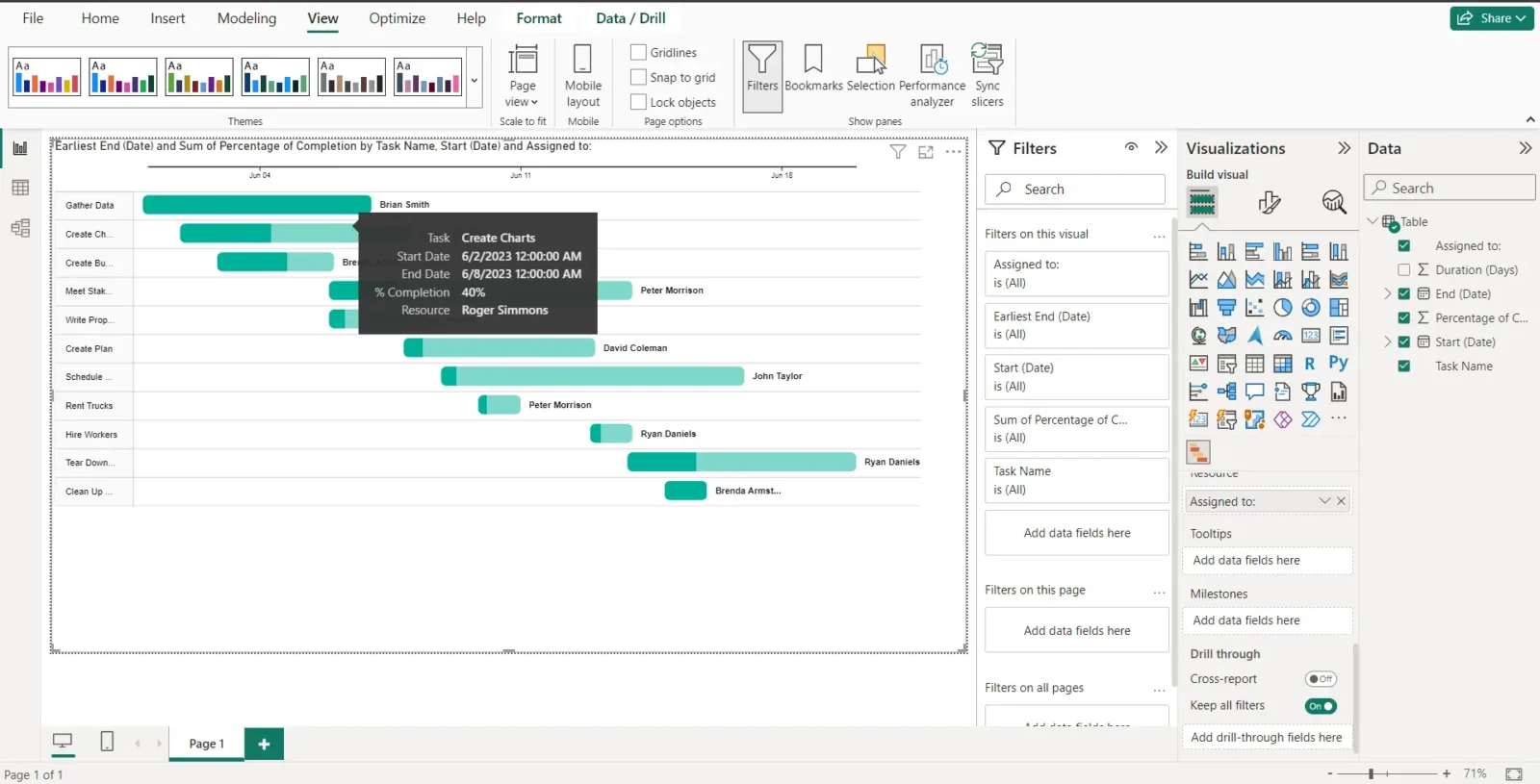
This Power BI Gantt chart example shows a construction schedule. In this image, we can see the timeline showing project dates at the top, the left column showing task names and finally the stacked bar charts representing each project task. Additionally, you can see how the color fill on each bar is formatted to represent the percentage of completion of each task. If you’d like to know more about a task, simply hover over it with your pointer and the Power BI Gantt chart will display the project task information you’ve entered.
Disadvantages of a Power BI Gantt Chart
Power BI Gantt charts can only display a project schedule based on the data you provide, but they won’t allow you to make any changes once they’re created. This means they’re only a representation of data, but not a functional Gantt chart for planning, scheduling or tracking projects.
- Isn’t project management software but data visualization software which explains its lack of project management features
- Changes to your project schedule require creating a new report by loading data and autogenerating a new Gantt chart
- No critical path analysis, task dependency mapping, workload management or project cost-tracking tools
PowerBI Gantt Chart Alternative: ProjectManager Integrates with PowerBI
ProjectManager is online project and portfolio management software that offers tools that help you plan, schedule and track your projects from start to end. It’s a powerful platform that’ll help you manage key areas of your projects such as resource management, project scheduling, cost tracking, task management and more. Best of all, it integrates with PowerBI, so you can connect your project data for in-depth analysis.
You can filter for the critical path and set a baseline to track planned vs. actual effort in real time. On top of that, ProjectManager’s Gantt chart user interface is intuitive and shows detailed information about your project. Now, let’s review other reasons that make ProjectManager the best alternative to Power BI Gantt charts.
Use Multiple Project Management Tools
Besides having a more powerful Gantt chart tool than Power BI, ProjectManager offers a variety of project management tools including kanban boards, dashboards, timesheets, kanban boards and more. All of these tools sync with each other to offer a complete project management solution, unlike Power BI, which is data management software.
Track Project Costs and Resources
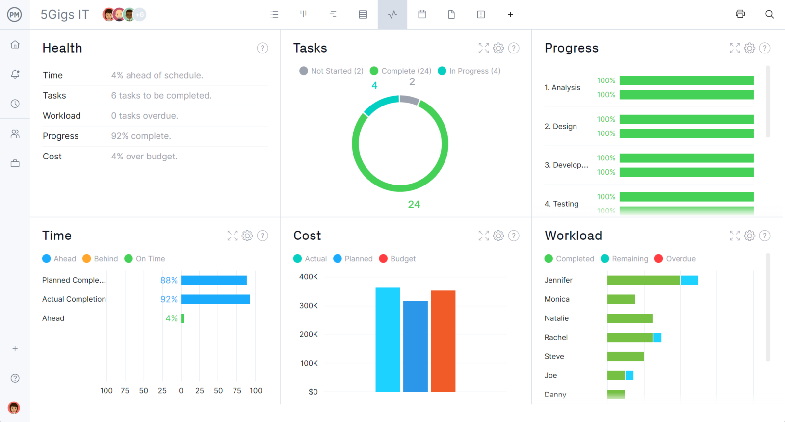
ProjectManager allows you to track the resources that’ll be used on each of your projects as well as their costs. Use any of its project management tools to list project tasks, along with their resources and costs and the software will add them and show your total project cost and resource availability in real-time dashboards and reports.
ProjectManager Integrates With Power BI
And, as we said, if you’re interested in Gantt charts but still want to use Power BI, this ProjectManager integration is the perfect solution for you. It combines all the data analysis functionality of Power BI with the project management software you need to manage your projects successfully.
How to Make a Power BI Gantt Chart From Scratch
Power BI facilitates the process of creating a Gantt chart based on data about your project tasks. Here’s how you can make a Power BI Gantt chart from scratch in three simple steps.
1. Load Project Data Into Power BI
The first step to creating a Power BI Gantt chart is to provide information about your project tasks such as task names, start and end dates, task durations, percent complete and who they’re assigned to. With this information, Power BI will automatically create a Gantt chart. To do so, click the spreadsheet icon on the left side of your screen and then click “Enter data” as shown in the image below.

Now, Power BI will ask you to create a table with the information that you’d like to show in your Power BI Gantt chart. For this example, we’ve entered the following data:
- Task name
- Start and end dates
- Task duration (in days)
- Percentage of completion
- Task assignee
You might enter this data manually in Power BI, or you can also copy and paste a table from Microsoft Excel. Once you’ve entered the data you need for your Power BI Gantt chart, you may click “Load.”
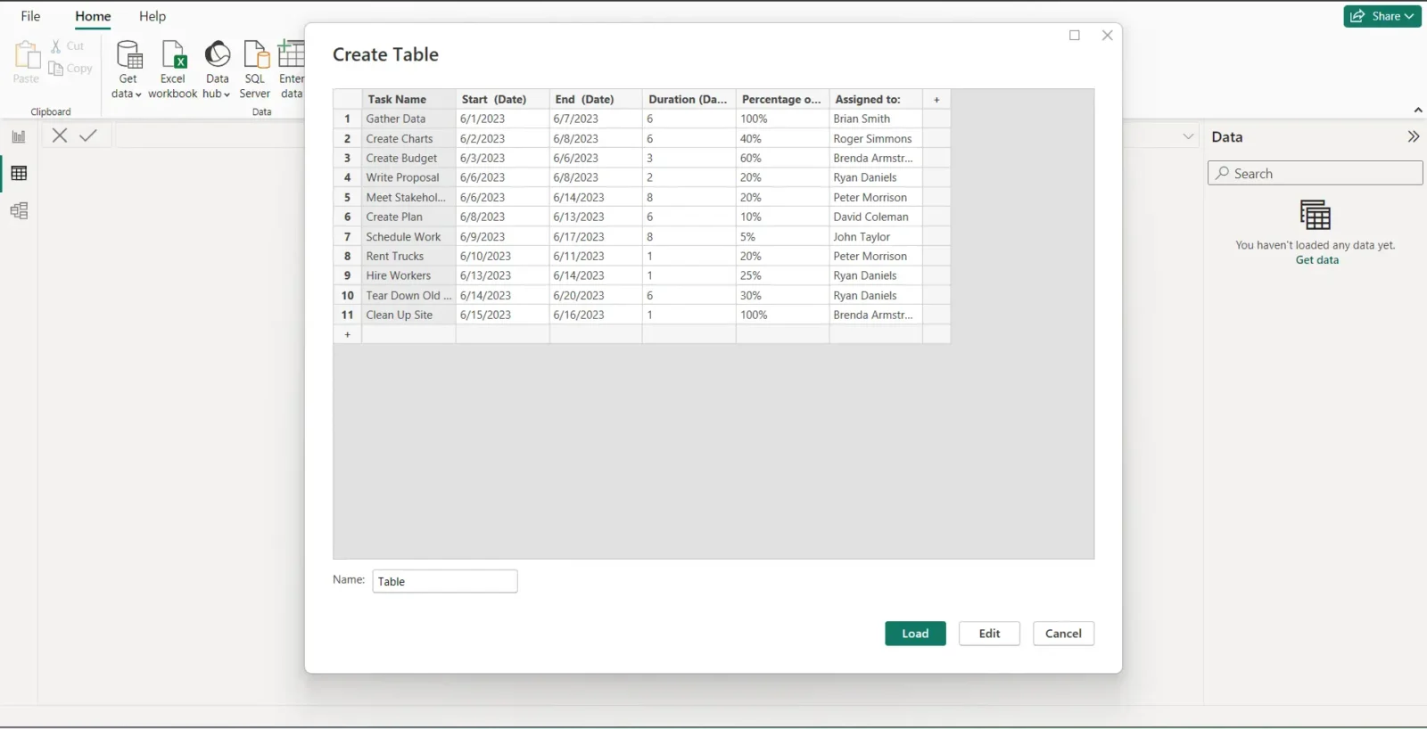
Here’s how the table view should look once you’ve completed the steps above. Now, let’s go back to the report view by clicking the report icon that’s highlighted in the screenshot below.

2. Get the Gantt Power BI Visual
Now that you’ve collected the data that’s necessary for making your Power BI Gantt chart, let’s create one. To do so, you’ll need to get the Gantt Power BI visual, an app you can get through Power BI’s built-in app store. This allows you to add different types of tools to the software.
On the right side, click on the three dots as shown in the image below, then select “Get more visuals.”
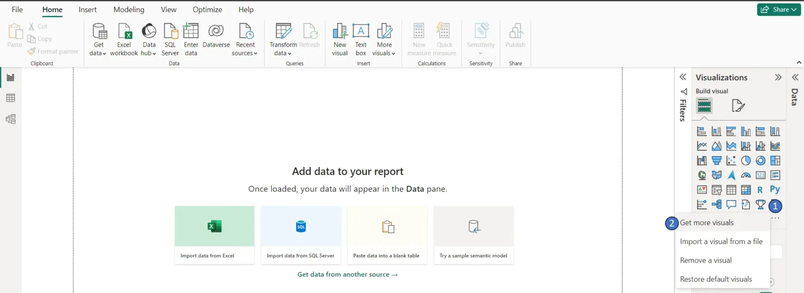
This will open Power BI’s library of visuals. Use the search bar to look for the Power BI Gantt chart visual and then select it. Make sure it’s the visual published by the Microsoft Corporation.
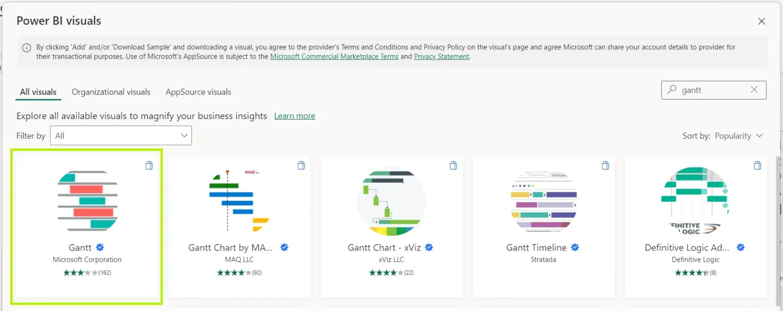
Power BI will let you know that your new visual has been successfully added to your report and a new icon will appear on the right side of your screen.

3. Insert Your Power BI Gantt Chart and Add Data to It
Click the Gantt icon, and a blank Gantt chart field will appear on the left as shown below. Now, you’ll need to use the “Data” column on the right side of your screen, which contains the data from the table that was previously added to Power BI. You’ll need to drag and drop the items in the “Data” column to their corresponding field in the “Visualizations” column, as pointed by the arrows in the image below.
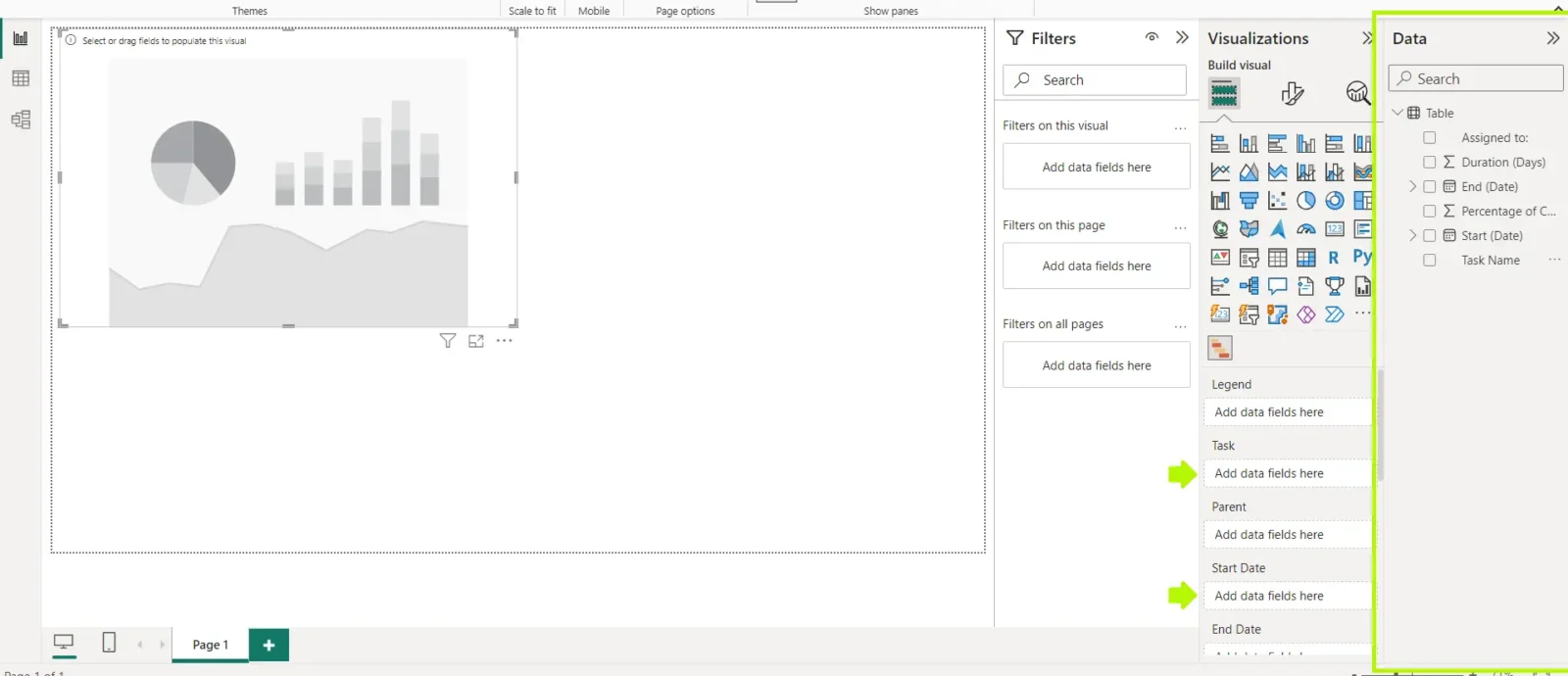
Congratulations, you’ve created a Power BI Gantt chart that shows your project tasks, their due dates, percentage of completion and who they’re assigned to on a timeline. You can now use this Gantt chart to track your team’s progress and make sure your project is delivered on time.

Advantages of a Power BI Gantt Chart
While it might not be designed for project management, there are still some advantages to using a Power BI Gantt chart. Its main advantage is that it automates the process of creating a Gantt chart. You’ll just need to get the project data outlined above and upload it into Power BI.
- Ideal for those getting started with Gantt charts but are comfortable with spreadsheets and other Power BI data analysis tools
- Compatible with other Microsoft products that can help you manage projects such as Microsoft Project and Microsoft Planner
- Easy to understand by both project managers and team members
More Power BI Gantt Chart Alternatives
Let’s learn about some of the best Power BI Gantt chart alternatives, so you can get a better idea of what a fully-featured Gantt chart from a project management software can do for your business or project.
1. Microsoft Project
Microsoft Project offers a variety of project management tools like Gantt charts, network diagrams, project calendars, resource tracking sheets and more. Microsoft Project it’s the most widely used popular project management software, mainly due to its large trajectory of over 40 years in the market, which led to its widespread implementation across organizations.
Microsoft Project Gantt charts are a good alternative for making a project schedule because they allow you to link task dependencies, identify critical path activities, track the completion of tasks, estimate the total duration of projects and establish project baselines. You can also track the utilization of project resources and their related costs.
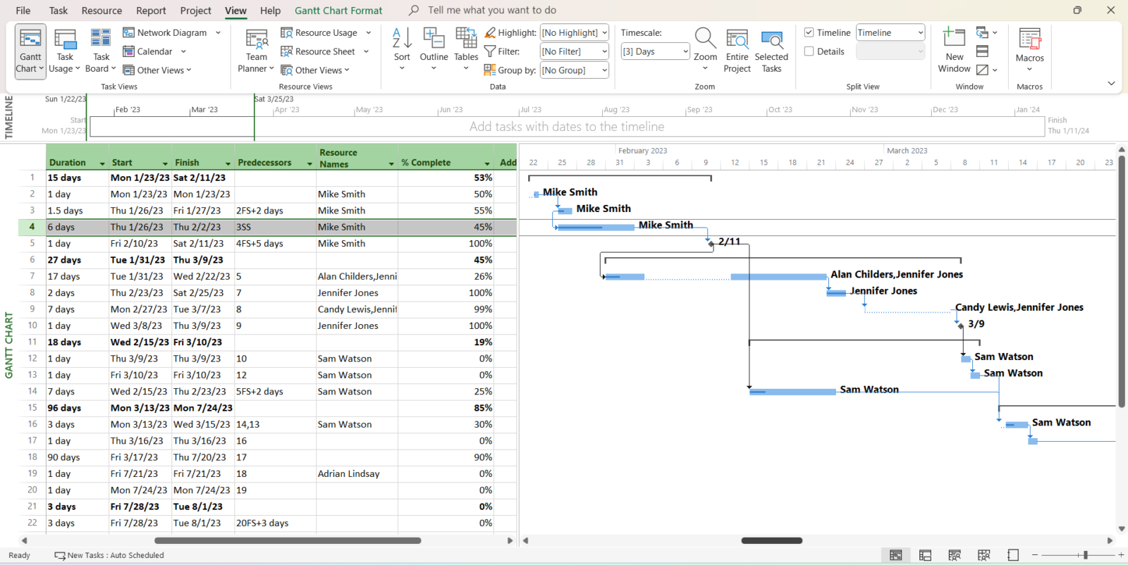
However, the main disadvantage of Microsoft Project is that it’s expensive. There are different versions of the software, Project Standard 2021 for $679 or Project Professional 2021 for $1,129 for a one-time purchase. Additionally, most users complain about the steep learning curve they have to go through to use the software. Luckily, many Microsoft Project alternatives offer the same project management features at a lower cost.
2. Microsoft Planner
Microsoft Planner offers a lightweight version of a Gantt chart, called a project timeline. Like a Power BI Gantt chart, its project planning and scheduling features are limited compared to more robust Gantt chart software alternatives.
However, unlike a Power BI Gantt chart, Microsoft Planner allows you to edit your Gantt chart tasks by dragging and dropping them to change their due dates, or expanding their size to increase their duration. Using Microsoft Planner, you can also add project tasks to your team members, link task dependencies set a priority for each task and track their percent complete.
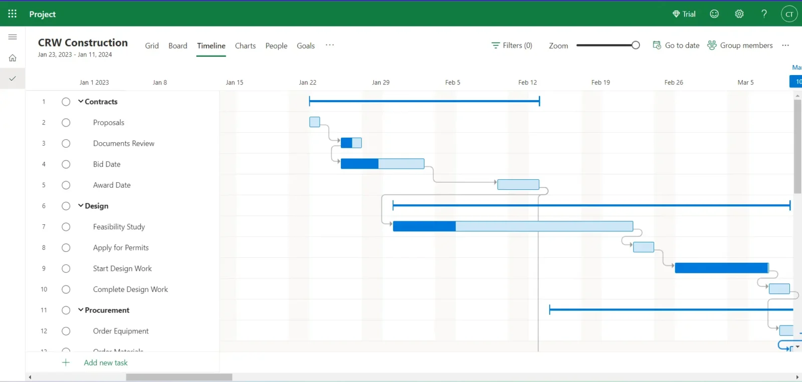
The main disadvantage of Microsoft Planner Gantt charts is that they can’t track critical information about your tasks such as resources and costs, because the software lacks project budgeting and tracking features. A Microsoft Planner Gantt chart only allows you to create a basic project schedule and track tasks’ due dates but not much more than that because Planner is a light version of Microsoft Project.
Related Power BI Gantt Chart Content
Choosing the right project management software for your team can be challenging. That’s why we’ve created blogs and guides to help you better understand what you should look for. Here are some blogs that are related to Gantt charts and Microsoft project management solutions.
- What Is Power BI? Uses, Features and Pricing
- Microsoft Project Gantt Chart: A How-to Guide With Pros, Cons & Alternatives
- Best Microsoft Project Alternatives: Free & Paid Options Ranked
- Microsoft Planner Gantt Chart: How to Make a Gantt Chart in Microsoft Planner
- Best Gantt Chart Software
- Best Microsoft Project Alternatives: Free & Paid Options Ranked
- Microsoft Planner vs. Project: In-Depth Software Comparison
ProjectManager is award-winning project and portfolio management software that helps you plan, manage and track projects in real time with multiple project views, including robust Gantt charts. Teams can share files, comment at the task level and stay updated with email and in-app notifications. Join teams at Avis, Nestle and Siemens who are using our software to deliver successful projects. Get started with ProjectManager today for free.

