Time is a constraint that applies to any project, particularly to dynamic, agile projects. While some industries are more time-sensitive than others, all industries have projects that incur many changes along the way.
A burndown chart helps agile project management teams keep track of what’s been done, what needs to be done and how much time is left in the project. While a burndown chart is traditionally a visual tool, it can also act as a list that outlines the work to be done and what percentage of it is complete.
What Is a Burndown Chart?
A burndown chart is a project management chart that shows how quickly a team is working through a customer’s user stories. This agile tool captures the description of a feature from an end-user perspective and shows the total effort against the amount of work for each iteration or agile sprint.
The quantity of work remaining appears on a vertical axis while the time that’s passed since the beginning of the project is placed horizontally on the chart, showing the past and the future. The burndown chart is displayed so everyone on the agile project management team can see it and updated regularly for accuracy.
Types of Burndown Charts
There are two burndown chart variants: a sprint burndown and a product burndown. A sprint burndown is used for work remaining in the iteration, while a product burndown illustrates the work remaining for the entire project plan.
Sprint Burndown Chart
Sprint burndown charts usually track progress within a single sprint, usually 1-4 weeks. It shows the remaining work for that specific sprint to help the team monitor progress and ensure they’re on track. The horizontal axis represents the days within the sprint and the vertical axis represents the remaining work, such as story points or hours.
Product Burndown Chart
Product burndown charts offer a broader view of the project’s overall progress. It tracks the remaining work for the entire product or a specific release that covers multiple sprints. The horizontal can represent sprints or iterations, while the vertical axis represents the remaining work in the product backlog.
Get your free
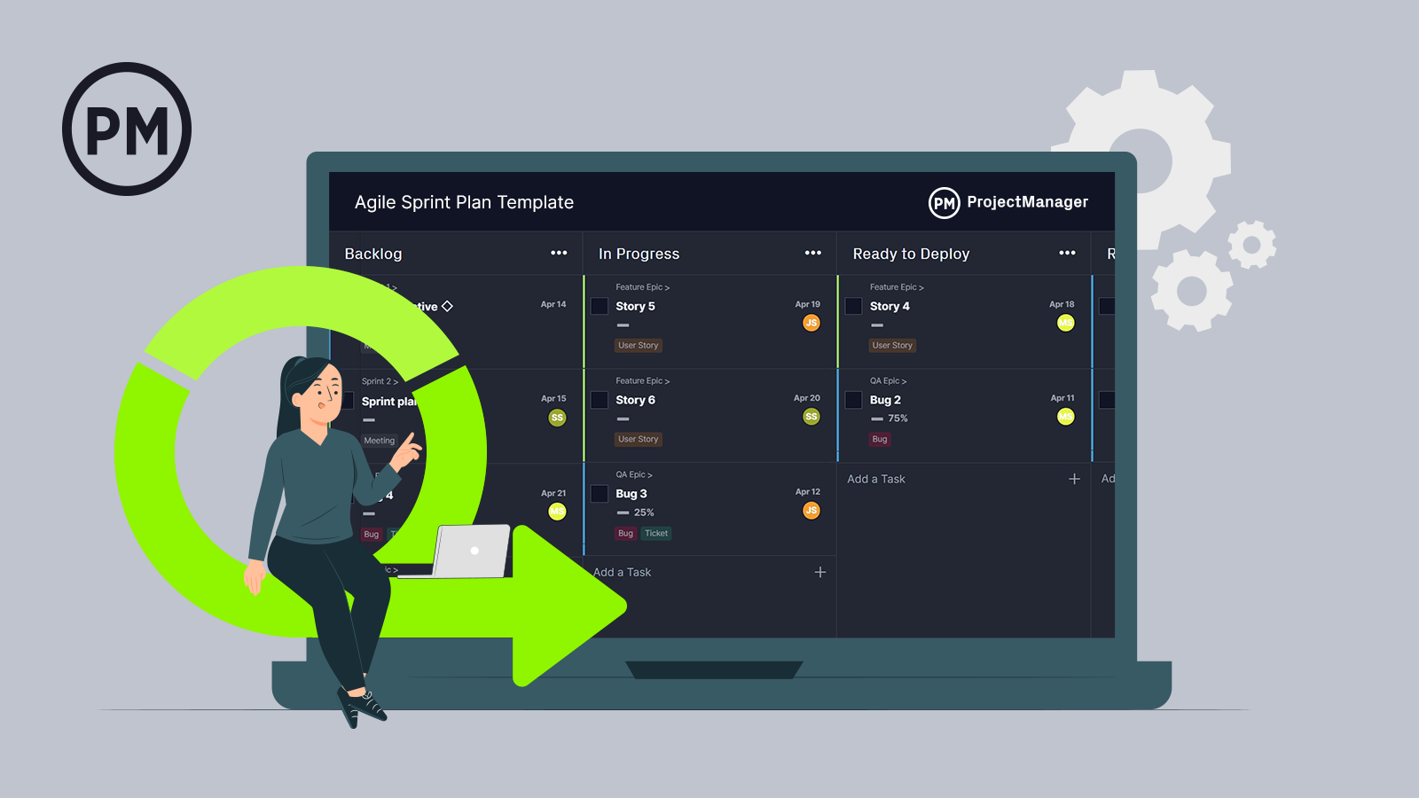
Sprint Planner Template
Use this free Sprint Planner Template to manage your projects better.
Get the template
Components of a Burndown Chart
Although the specifics can vary, it’s common to see the below sections of a burndown chart.
Axes
A burndown chart has two axes, x and y. The horizontal axis represents time while the vertical axis displays user story points. The rightmost point of the chart indicates the start of a project or agile sprint while the leftmost point shows its end.
Ideal Work Remaining Line
As its name suggests, the ideal work remaining line indicates the remaining work that a team has at a specific point of the project or sprint under ideal conditions. Project managers use past data to estimate this baseline and draft a straight line across the burndown chart. The ideal work remaining line should always have a negative slope.
Actual Work Remaining Line
The actual work remaining line indicates the remaining work a team has at any point of the project timeline. Unlike the ideal work remaining line, this is not an estimate, but rather a realistic depiction of the team’s performance. The line is drawn as the team progresses and completes user stories. Actual work remaining lines are usually not straight as teams work at different paces as projects are completed.
ProjectManager is online software that offers multiple project views to help you collect and track your burndown chart. Our list view captures your tasks and shows how much work is left before tasks are complete. This real-time data access allows team members to comment and share files as needed. Get started with ProjectManager today for free.

Burndown Chart vs. Burnup Chart
A burndown chart and a burnup chart are very similar—they have the same components, achieve the same purpose and are used for agile project management. But there’s one major difference.
On one hand, the burndown chart keeps track of the remaining work by removing user stories from the vertical axis as they’re completed while the burnup chart adds user stories to the vertical axis as they get done.
How to Read a Burndown Chart
The burndown chart has several points. There’s an x-axis, which is the project or sprint timeline. The y-axis is the work that needs to be completed in the project. The story point estimates for the work that remains are represented by this axis.
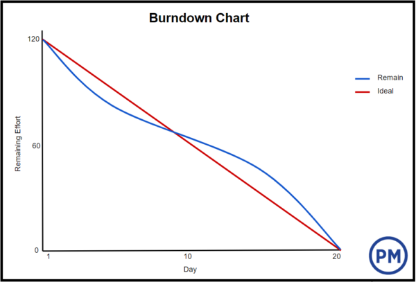
The project starting point is the farthest point to the left of the chart and occurs on day zero of the project or iteration. The project endpoint is farthest to the right and marks the final day of the project or iteration.
Ideal Work Remaining Line
There is an ideal work remaining line which is a straight line connecting the starting and ending points. This line represents the sum of estimates for all tasks that need to be completed, or in other words, the scope of the project. At the endpoint, the ideal line crosses the x-axis and shows there is no work left to be done. This line is based on estimates and therefore is not always accurate.
Actual Work Remaining Line
The actual work remaining line shows the actual work that remains in the project or iteration. At the beginning of the project execution phase, the actual work remaining and the ideal work remaining are the same, but as the project or iteration progresses, the actual work line fluctuates above and below the ideal work line. Each day, a new point is added to this line until the project or iteration is completed to make sure it’s as accurate as possible.
If the actual work line is above the ideal work line, it means there’s more work left than originally thought. In other words, the project is behind schedule. However, if the actual work line is below the ideal work line, there is less work left than originally predicted and the project is ahead of schedule.
Burndown Chart Examples
A visual depiction of a burndown chart can help bring the concept to life. Below are two more examples to better illustrate a burndown chart.
Burndown Chart Example with Actual vs Ideal
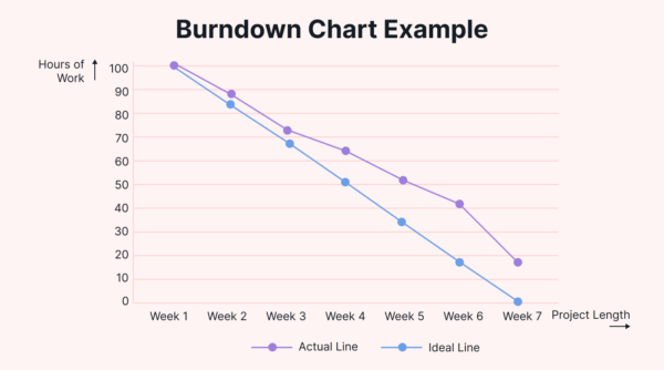
In this burndown chart example, the blue ideal line shows how the project would progress if all things went perfectly. It marks the pace at which tasks should be completed to finish the project on time. The purple line is the actual line that represents the team’s progress. It shows if the team is ahead, behind or on schedule at various weeks throughout the project.
Burndown Chart Example with Estimated Line
This burndown chart example has the work that’s left to do on the horizontal axis, while time is on the vertical axis. There are three lines, each representing different types of progress. The green estimated line shows the estimated progress calculated using the due date and estimated hours.
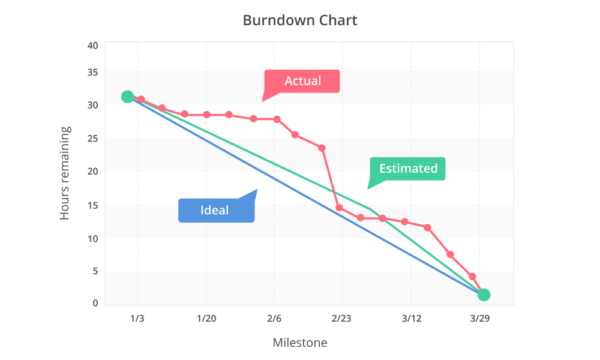
The ideal line is the blue straight line that averages the number of tasks by the number of days. As time progresses, the volume of tasks decreases. The red line represents the actual progress and any outstanding tasks. As tasks are completed, the estimated hours decrease.
Who Uses a Burndown Chart?
Agile teams, including project managers and scrum masters, often use a burndown chart to track and manage projects. These charts help monitor the project’s progress against the planned schedule, allowing these roles to identify delays before they cause a major impact. Scrum masters may also use a burndown chart to communicate the project status to stakeholders.
Development teams also use burndown charts to visualize how much work remains and if they are on schedule to complete it. It fosters transparency and accountability, helping the development team to self-manage. Other roles that may use this tool include product owners or stakeholders.
How to Use a Burndown Chart in Agile & Scrum
Agile project management relies on agile sprints to plan and execute projects. These sprints are short iterations of work where a team accomplishes specific goals that are initially set during a sprint planning meeting. Burndown charts are ideal for agile project managers as they allow them to keep track of the work remaining, compare performance against a baseline and quickly determine whether they’re behind schedule. Here are some examples of how to use a burndown chart to help you manage an agile or scrum project.
- Create a work management baseline to compare planned vs. actual work
- Complete a gap analysis based on discrepancies
- Get information for future sprint planning meetings
- Reallocate resources and manage tasks to complete sprints on time
What Are the Benefits of a Burndown Chart?
The obvious benefit of a burndown chart is that it provides an updated status report on the progress of the project. Having a visual representation of this key data keeps everyone on the same page.
Displaying a burndown chart prominently for all to see keeps everyone involved and encourages the team to deal with issues before they evolve into problems. It should be the focal point of the workspace so that it helps direct conversation toward the project and its progress.
The simplicity of the burndown chart is also extremely helpful as it outlines the velocity history of the project. Velocity is an agile term that means the total effort estimates associated with user stories that were completed during an iteration.
What Are the Limitations of a Burndown Chart?
The burndown chart doesn’t reveal everything. For example, it only shows the number of story points that have been completed. The burndown chart doesn’t show any changes, for example, in the scope of work as measured by the total points in the backlog.
As a result, it can be hard to tell if changes in the burndown chart are due to completed backlog items or because of an increase or decrease in story points. Having a burnup chart resolves this problem by having a separate line in the graph for the overall backlog size.
However, neither a burndown nor a burnup chart offers any indication of which product backlog items have been completed. While a burndown chart might show progress, it may not represent whether the team is working on the right tasks. These charts are often a way to show trends rather than represent whether the team is delivering the right product backlog items. If you’d like to prioritize project tasks, you may use an Eisenhower matrix instead.
It Relies on Good Estimates
Another issue with burndown charts revolves around the accuracy of the ideal work line. Whether the actual work line is above or below the ideal work line depends on the accuracy of the original time estimates for the tasks. If a team is overestimating time requirements, progress appears on track or ahead of schedule. But if the team is underestimating the time requirements, it will appear that they’re behind schedule.
There’s a way to respond to this issue—incorporating an efficiency factor into the burndown chart. After the first iteration of a project, the efficiency factor is recalculated to allow for more accuracy.
How ProjectManager Helps With Sprint Management
A burnout chart is important but it’s not the only guide that scrum teams can reference. There are many other reports and tools that can improve the probability of success. ProjectManager is an online collaborative software with the features scrum teams need to manage their sprints better.
Real-Time Dashboards
If you need a high-level view of your project, ProjectManager has a real-time dashboard that tracks your sprint as it happens. Data automatically populates for the most accurate view of your project. Teams can make decisions based on current project data as opposed to referencing old data.

Robust Kanban Boards
Reporting on progress is only one part of what a scrum team needs. They also require tools that allow them to manage product backlogs and sprints. ProjectManager has this portion of the sprint covered too, with kanban boards that visualize workflows, collect user stories and prioritize tasks. Scrum teams will always know what to work on and when. The kanban boards feed directly into ProjectManager’s reporting features for total project visibility.
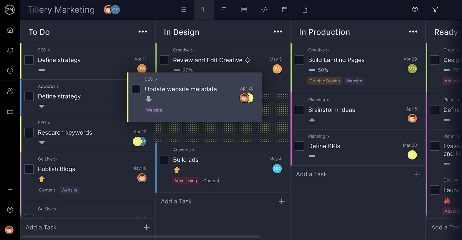
Product owners and scrum masters will also appreciate the kanban for its transparency in the sprint. When going through a sprint retrospectively, the kanban is an archive of what went right and what went wrong, allowing for future improvements.
Managers must keep their eye on the progress of a project. If they don’t, then they’re risking the successful completion of the project. A burndown chart is just one of the many tools that lead to project success. ProjectManager is a cloud-based project management software that any manager will want to have in their toolbox. It has features such as a real-time dashboard to monitor and report on progress, and an online Gantt chart to streamline scheduling and help with collaboration. Try it today for free with this 30-day trial.

